How to use the app?
The application, that is reachable from here , shows real time data around selected path
The App
At the beginning, the application shows a map of Chicago with layer controls, a weather box and the currently selected path
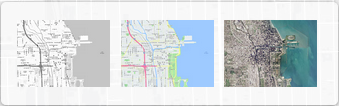
On the bottom left part of the screen, we have a small controller to select three different map views and the path controls
Weather
Map Controls
Path Controls

All the data is shown either in a bounding box or around given path extended up to 2 block radius.
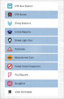
The data shown as different layers on map are :
- CTA Bus stops
- Divvy Stations
- Crimes reported
- Street lights One out and All out - Currently Open
- Pot holes - Currently Open
- Abandoned Cars
- Failed Food Inspection
- Foursquare
Layer Toggle
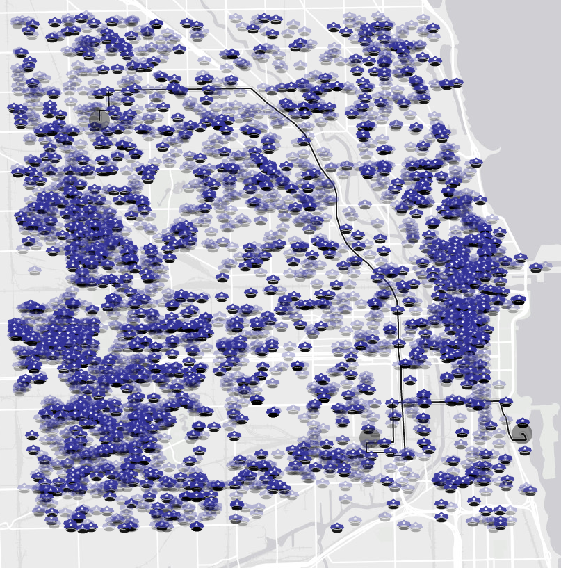
All the shown data is temporally classified into last week and last month data.
This distinction is graphically represented with opacity of the icons on the map. The less visible an icon is the less temporally recent it is
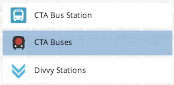
To show particular data layer user has to click on the category he is interested on the layer controller present on left.
This turns on the selected layer and data is plotted on the graph. The user has to click again on the layer controller to turn off that specific layer.
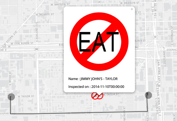
Additional details regarding a particular incident can be obtained by simply clicking on the corresponding icon on the map. This will give us a popup box showing all the other details available for that particular incident
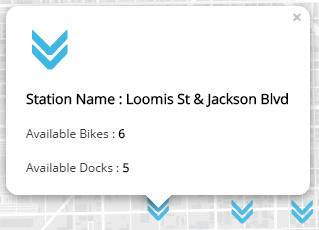
For example on clicking on one of the icons of divvy stations you can get information on number of bikes available, no. of docks available at that station etc.
Selected Layer
Divvy Popup
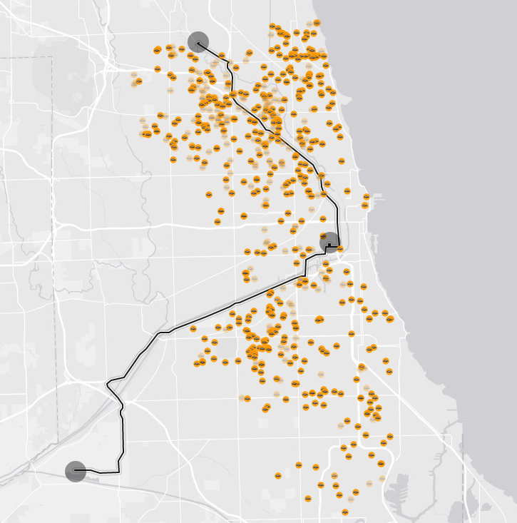
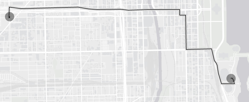
By default the route from UIC to Museum Campus is shown on the map. User has the freedom to change the source and destination.
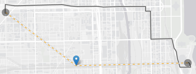
He can do this by moving the end points of the route that is drawn. He can also change the route by clicking anywhere on the route and draging it to his desired location on the map.
All the above mentioned data points will be shown around this path extending up to 2 blocks in radius.
UIC To Museum Campus
Dragged Pin
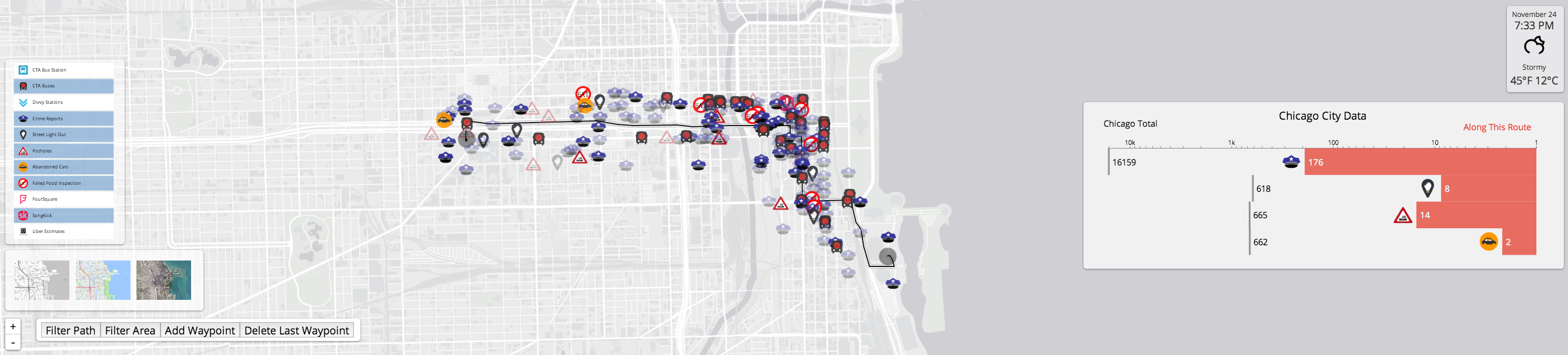
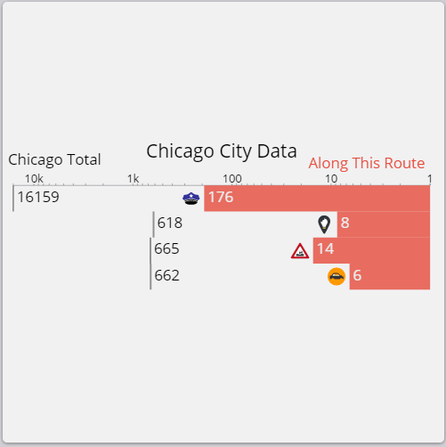
On the right of application we see the graphs. 'Along Your Route' graph shows the number of potholes, abandoned vehicles, crimes reported, street lights out around the selected path. This graph refreshes as you keep on updating the path on the map by dragging the pins.
The same graph shows the data described before but for the entire Chicago City. This gives a nicer way for the user to compare data along his route to the whole city's data.
Graphs
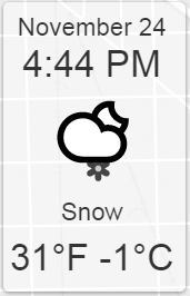
The weather box on the top left of the screen gives current date and time, weather and temperature in Celsius and Fahrenheit scales. It also gives you information of the weather condition.
Weather
Sample animated Weather Icon

CTA BUS Stations
Clicking on this component will plot the CTA bus stations around the given path.
On clicking on particular station we get Station Name on the popup box.
CTA Buses
This layer when activated plots all the CTA bus services that are currently running around the given path.
The position of buses is updated for every minute as per the information proided by the CTA API.
Clicking on particular bus will give you the route of the bus you selected and its destination.
Divvy Stations
Activating this layer will plot all the available divvy stations around the selected path.
Clicking on particular station will give you additional details like number of bikes available and number of docks available in those stations.
Crime Reports
This layer will plot the locations where crimes are reported. Clicking on particular crime marker will give you details on when the crime has been reported.
Street Light Out
This layer when activated plots location where a streetlight is not working. It also plots a marker if none of the street lights are working in given location.
Potholes
Activating this layer will plot all the potholes that are currently open around given route. Selecting on a particular pothole marker will give you when is that pothole reported.
Abandoned Cars
This layer when activated plots the location of abandoned cars that are reported. As in the previous case it gives you when the car has been reported.
Failed Food Inspection
This layers plots the markers on locations where restaurants have failed in their food inspection reports.
Selecting on particular marker will give you the name of restaurant and when the inspection happened.
Foursquare
Foursquare layer plots the most popular/checked-in places around the center of the given.
Selecting on particular marker will give you the name of the place that most people have checked-in and what type of venue is that like Art Museum, Restaurant etc.
Uber Estimates
For activating this layer we need to give the source and destination points. After providing them we will get the cheapest Uber product available and the estimated price for that Uber product.
Song Kick
This data layer gives us the list locations where some recreational activity like concerts are happening around the city.
On clicking particular marker we can get additional details like name of the event, date of the event and what type of event it is.